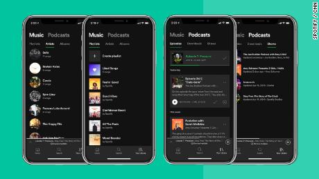
The redesign, which was announced and launched Thursday, brings tabs to the library section of a subscriber’s app: one for music and one for podcasts.
People will be able to swipe or tap between the two tabs to get to the content they want.
Spotify (SPOT) didn’t respond to a request for comment about what led to the redesign.
In April, it announced plans to invest between $400 million and $500 million in the “emerging podcast marketplace.” The move is an attempt to expand its current offerings in the hope of retaining subscribers and gaining new ones.
It’s acquired several different podcasting companies and last week announced a new exclusive podcast partnership with the Obamas.
Daniel Ek, CEO of the Swedish company, has said people’s interest in reducing screen time opens up “a massive audio opportunity.”
While Apple (AAPL) dominates the podcast space, Spotify is solidifying its position as an important platform for podcasters.
The podcast tab has three sections — episodes, downloads and shows. Spotify said in a statement that the new look will give people “more control” and help them “quickly” discover new podcasts.
The music tab is broken into playlists, artists and albums. With the “streamlined” redesign, people will be able to access music faster, according to Spotify.
“Everything about the reimagined Library is designed to get you to the content you want faster,” Spotify said.
The redesign comes amid other changes. On Wednesday, Spotify launched a new playlist called “Your Daily Drive,” which gives people the experience of listening to the radio. In May, Spotify said it was testing a voice-controlled device for cars called “Car Thing.”
Spotify has also said it may test similar devices for homes, which could compete with the Amazon Echo, Google Home and Apple HomePod. Research suggests music streaming is one of the most popular uses of smart speakers.
Spotify recently revealed it has over 217 million monthly global users and over 100 million paid subscribers.
Views: 347


